Templates Inputs
The power to create advanced forms lies in understanding how react-jsonschema-form works. Here you will find examples that are in JSON, but converting from JSON to YAML is straightforward! You can also check the documentation for this library here.
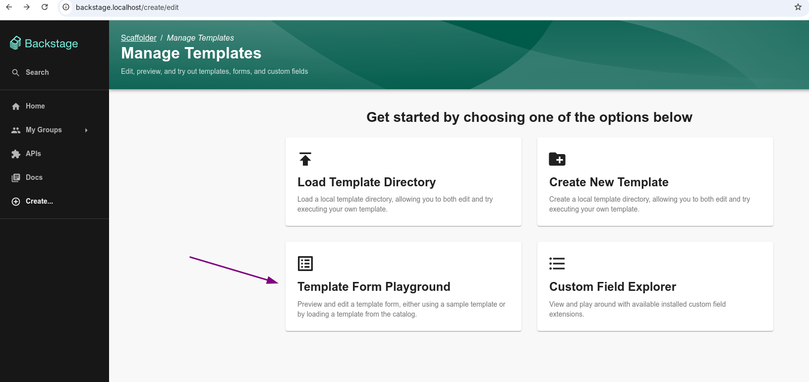
Template Editor
A feature we can leverage in Backstage to help us create our templates, especially in an initial stage.
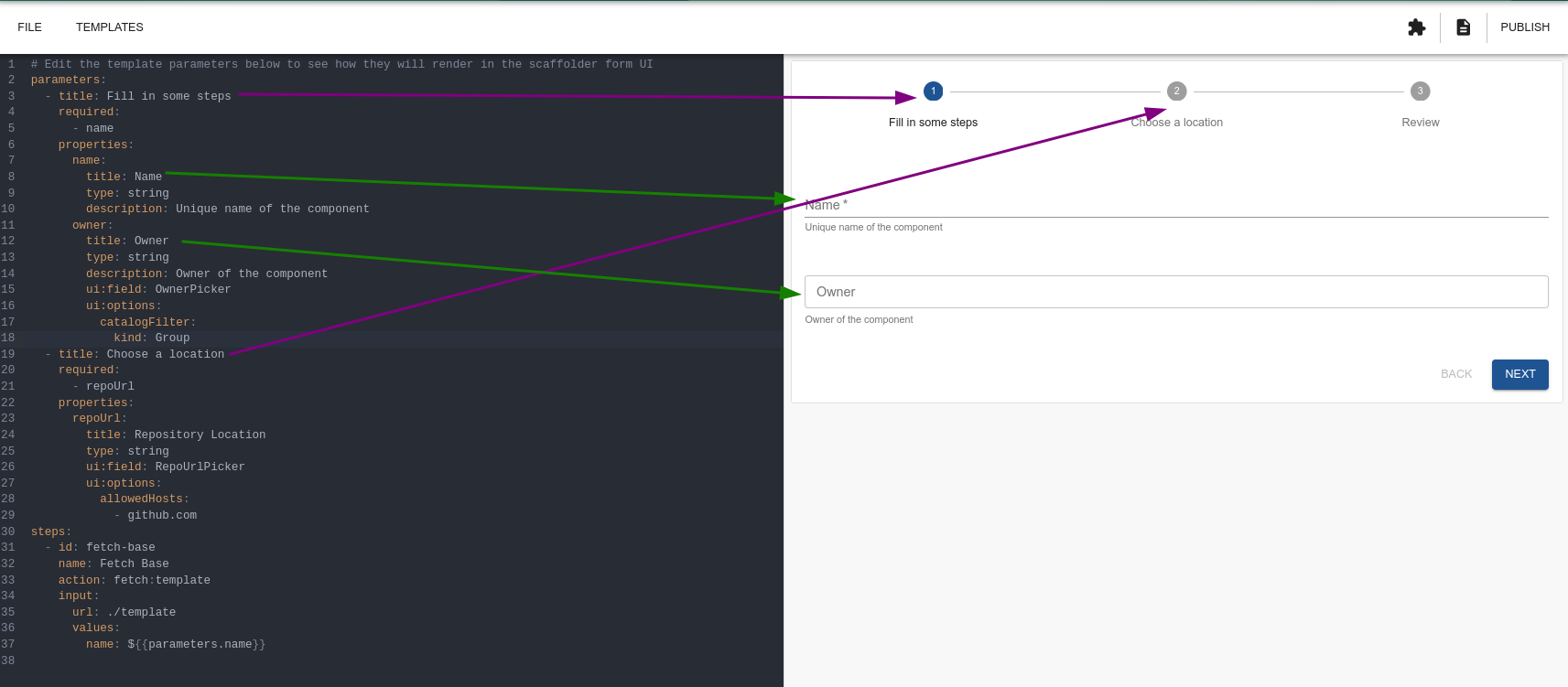
As we change the code, the resulting form is displayed alongside.
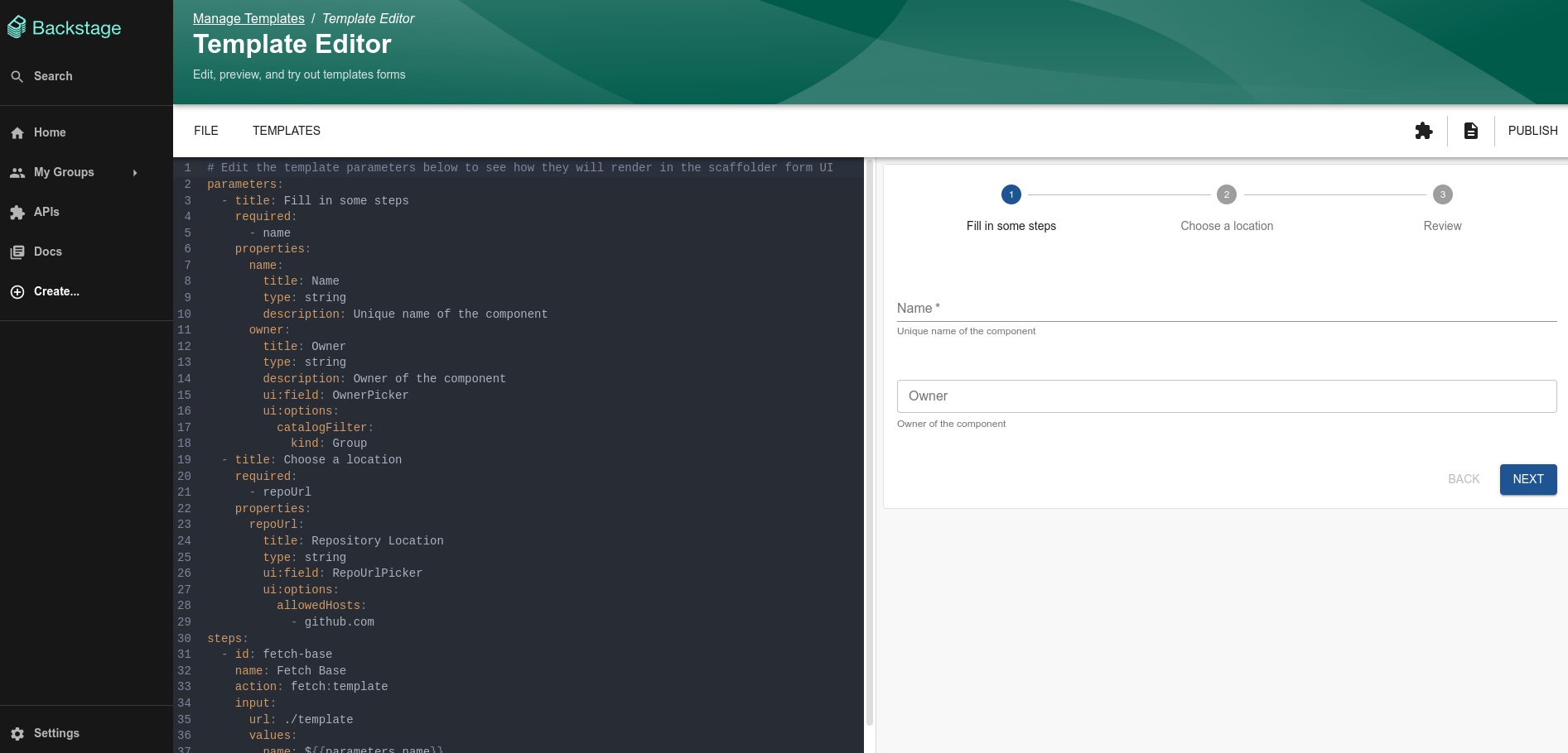
Let's use this editor to run tests while explaining the fields.
Parameters
The parameters field in templates represents the input data that the user must provide when executing or configuring the template. It is a list of parameter definitions that:
- Defines what information the user needs to provide.
- Specifies the types, validations, descriptions, and expected behavior of these inputs.
- Serves as the basis for creating the user interface (UI) for data entry.
An object in the parameters list can contain:
title (required)- Defines the title of the section/parameter group.
- Type: string.
description (optional)- Provides an additional description of the section to help the user.
- Type: string
properties (required)- Defines the fields (parameters) that the user must fill in. We'll discuss this further below.
- Type: object containing key: value pairs
required (optional)- Lists the names of required fields defined in properties.
- Type: array of strings.
allOf, anyOf, oneOf (optional)- Defines conditions or additional validations for the fields.
- Type: array of objects with specific validations.
- Examples:
- allOf: All conditions must be met.
- anyOf: At least one condition must be met.
- oneOf: Only one condition must be met.
if, then, else (optional)- Allows applying conditional logic to fields based on the values of other fields.
- Type: objects that specify:
- if: The condition to be checked.
- then: What happens if the condition is true.
- else: What happens if the condition is false.
errorMessage (optional)- Defines custom error messages for failed validations.
- Type: object with key: message pairs, where the key is the field or validation.
Titles
Titles divide the form filling into steps. Basically that.
We could do everything in a single step; it's more a matter of organization. Each time we create a title, the next button moves to the next title (section) until reaching the review that will apply the steps.
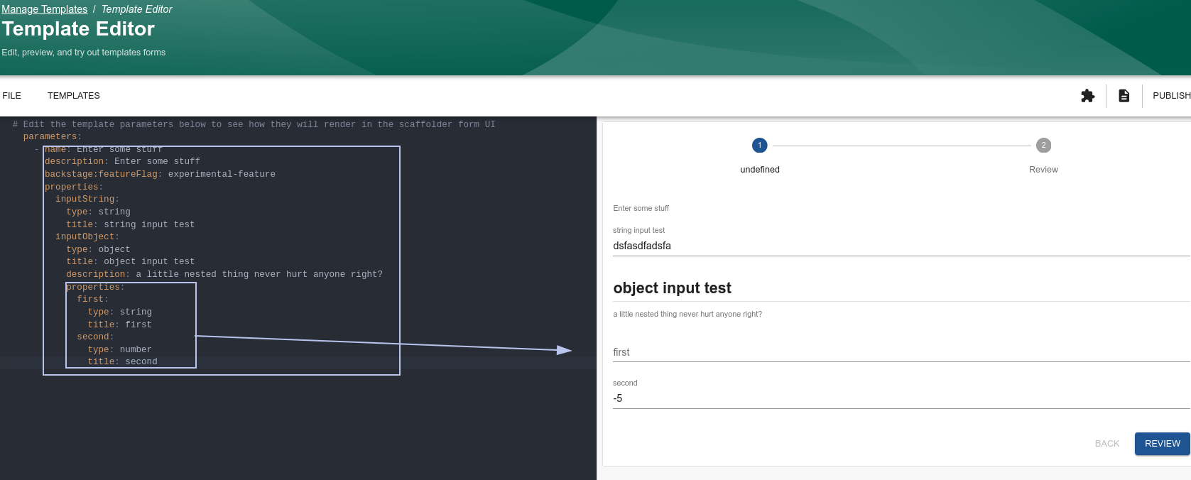
Properties (Inputs)
Within properties, each object will be the field value. We can say it would be the variable value, and within the block we have its definitions with the following keys:
type (required)Specifies the data type of the field.- Valid types: string, integer, boolean, array, object. When we have an object type, we declare another properties inside it; we'll see this in the last example.
title (optional)The field title, displayed in the interface.- Type: string.
description (optional)Provides explanatory text about the field.- Type: string.
enum (optional)Restricts the possible values of the field to a fixed list.- Type: array with values.
default (optional)Default value for the field.- Type: Depends on the type.
minimum, maximum (optional)Defines minimum and maximum values for integer type fields.Type: number.minLength, maxLength (optional)Defines the minimum/maximum number of characters for string type fields.- Type: integer.
format (optional)Defines specific formats for the field (e.g., email, uri, date-time).patternDefines the regex if the type is a string.- Type: string.
ui:*(optional) Specific configurations for the user interface.- Examples:
- ui:widget: Type of widget used (checkbox, textarea).
- ui:field: Custom field (OwnerPicker).
- ui:options: Additional options for customization.
- Examples:
dependencies (optional)Defines dependent fields that only appear if the main field has a specific value.- Type: object.
There are more fields; if we explained everything, we would have to document the react-jsonschema-form library here, and that's not the purpose.
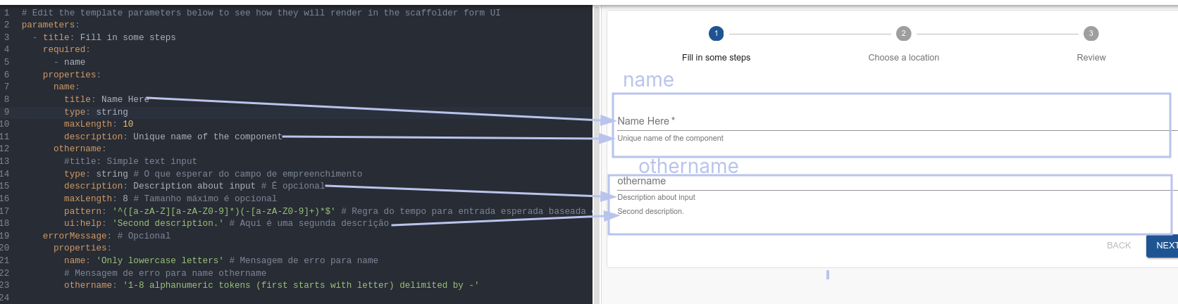
Some examples:
parameters:
- title: Fill in some steps
properties:
name:
title: Simple text input # If not defined, the variable name will appear, in this case name.
type: string # Required. What to expect from the input field.
description: Description about input # It's optional
maxLength: 8 # Maximum length is optional
pattern: '^([a-zA-Z][a-zA-Z0-9]*)(-[a-zA-Z0-9]+)*$' # Field rule for expected input based on regex, optional
ui:autofocus: true
ui:help: 'Hint: additional description...' # This is a secondary description
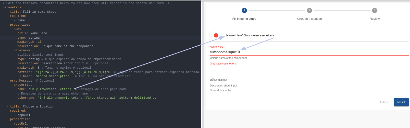
errorMessage: # Optional
properties:
name: '1-8 alphanumeric tokens (first starts with letter) delimited by -' # Error message for name
Let's explain the initial details first.
Generating an error.
The specific error for each of the fields.
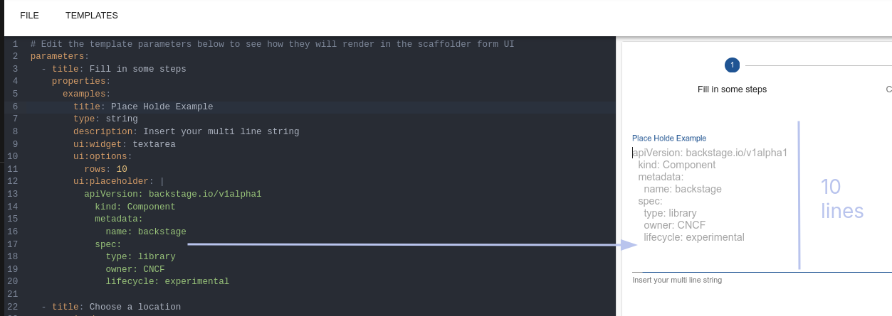
We can have a multi-line input if necessary. Often it's necessary to pass entire content to create a file. A kubeconfig would be a great example!
parameters:
  - title: Fill in some steps
    properties:
      examples:
        title: Place Holder Example
        type: string
        description: Insert your multi line string
        ui:widget: textarea
        ui:options:
          rows: 10
        ui:placeholder: |
          apiVersion: backstage.io/v1alpha1
            kind: Component
            metadata:
              name: backstage
            spec:
              type: library
              owner: CNCF
              lifecycle: experimental
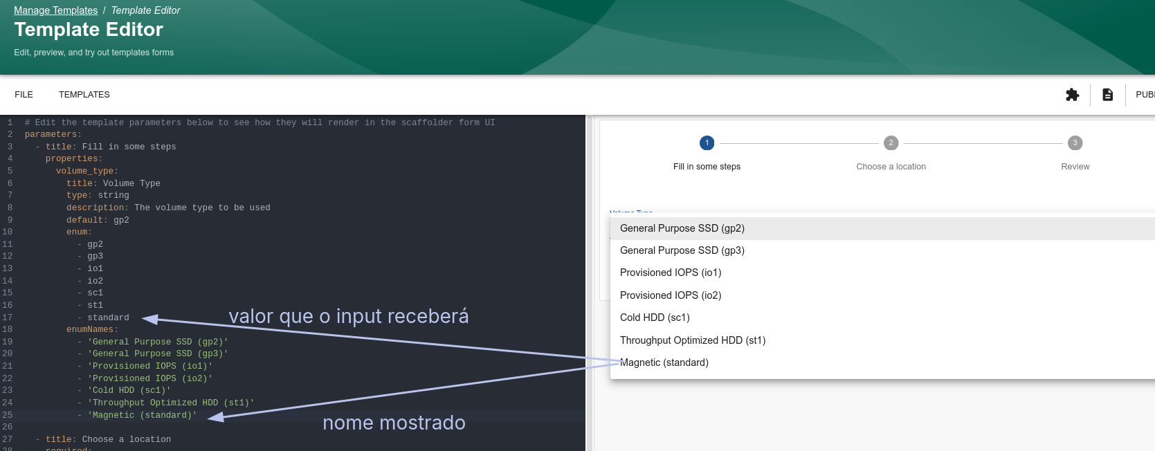
An example of selection among possible values.
parameters:
  - title: Fill in some steps
    properties:
      volume_type:
        title: Volume Type
        type: string
        description: The volume type to be used
        default: gp2 # This will be the default value if there's no change
        enum:
          - gp2
          - gp3
          - io1
          - io2
          - sc1
          - st1
          - standard
        enumNames:
          - 'General Purpose SSD (gp2)'
          - 'General Purpose SSD (gp3)'
          - 'Provisioned IOPS (io1)'
          - 'Provisioned IOPS (io2)'
          - 'Cold HDD (sc1)'
          - 'Throughput Optimized HDD (st1)'
          - 'Magnetic (standard)'
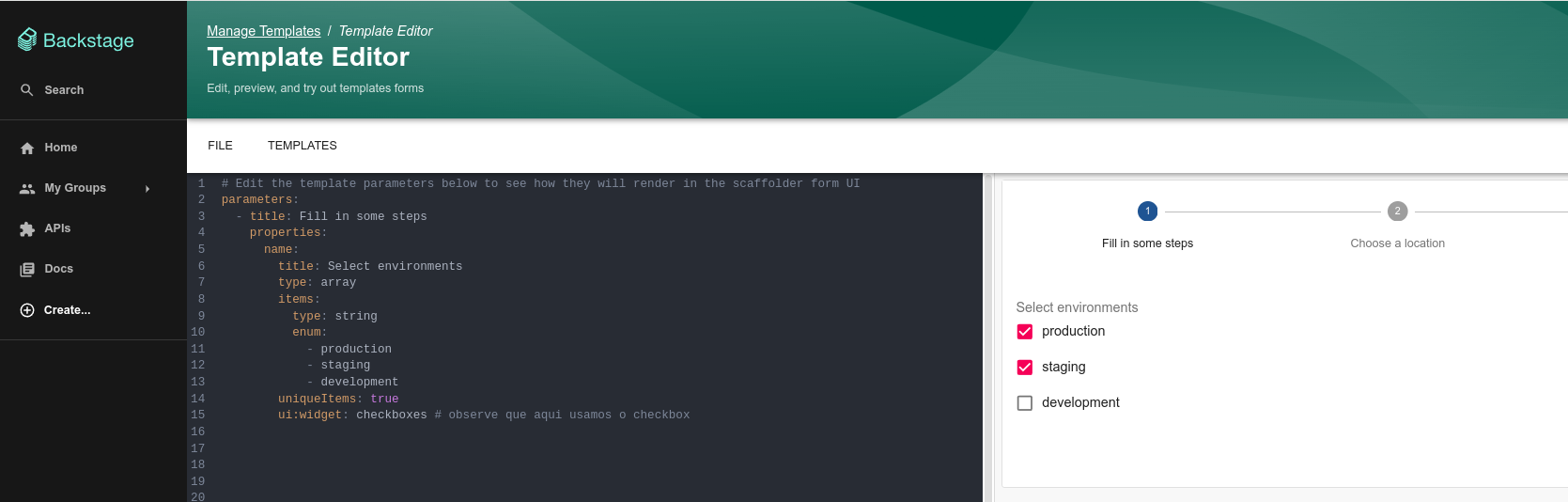
Sometimes it's necessary to choose more than one.
parameters:
  - title: Fill in some steps
    properties:
      name:
        title: Select environments
        type: array
        items:
          type: string
          enum:
            - production
            - staging
            - development
        uniqueItems: true
        ui:widget: checkboxes # note that here we use checkbox
Sometimes it's necessary to mix.
Several examples using a boolean.
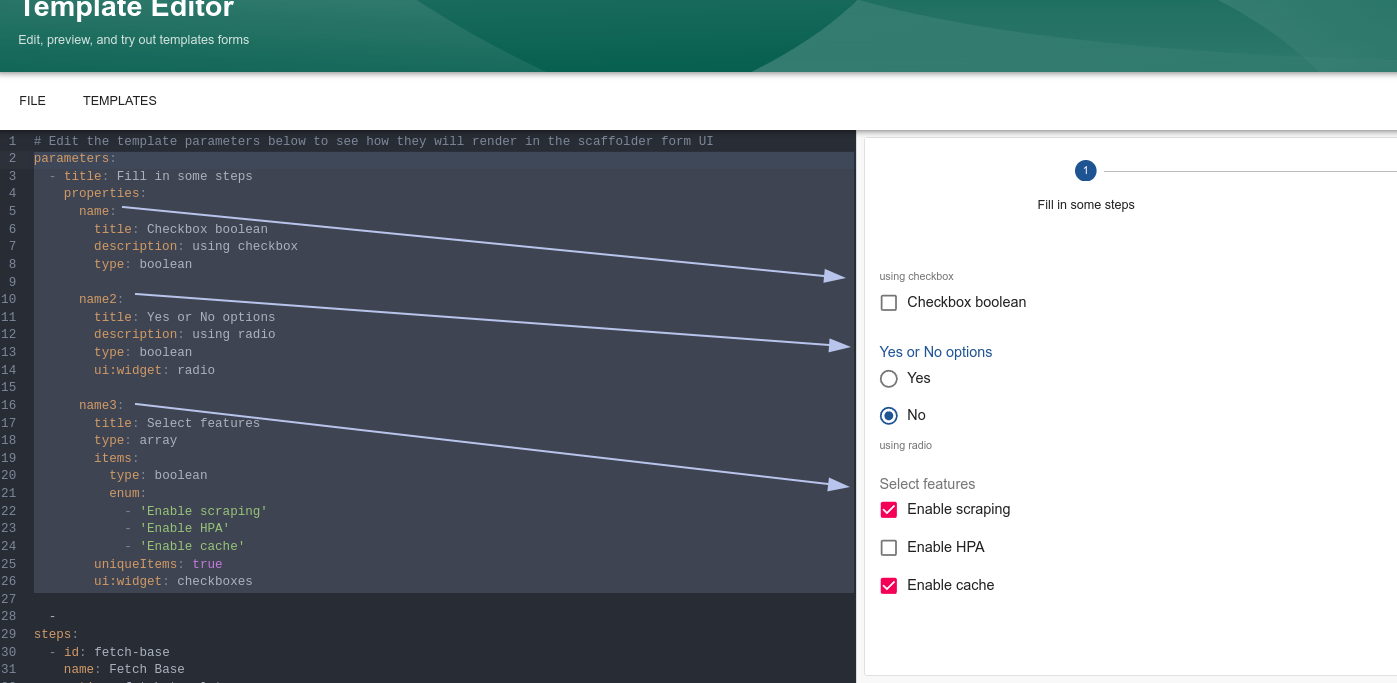
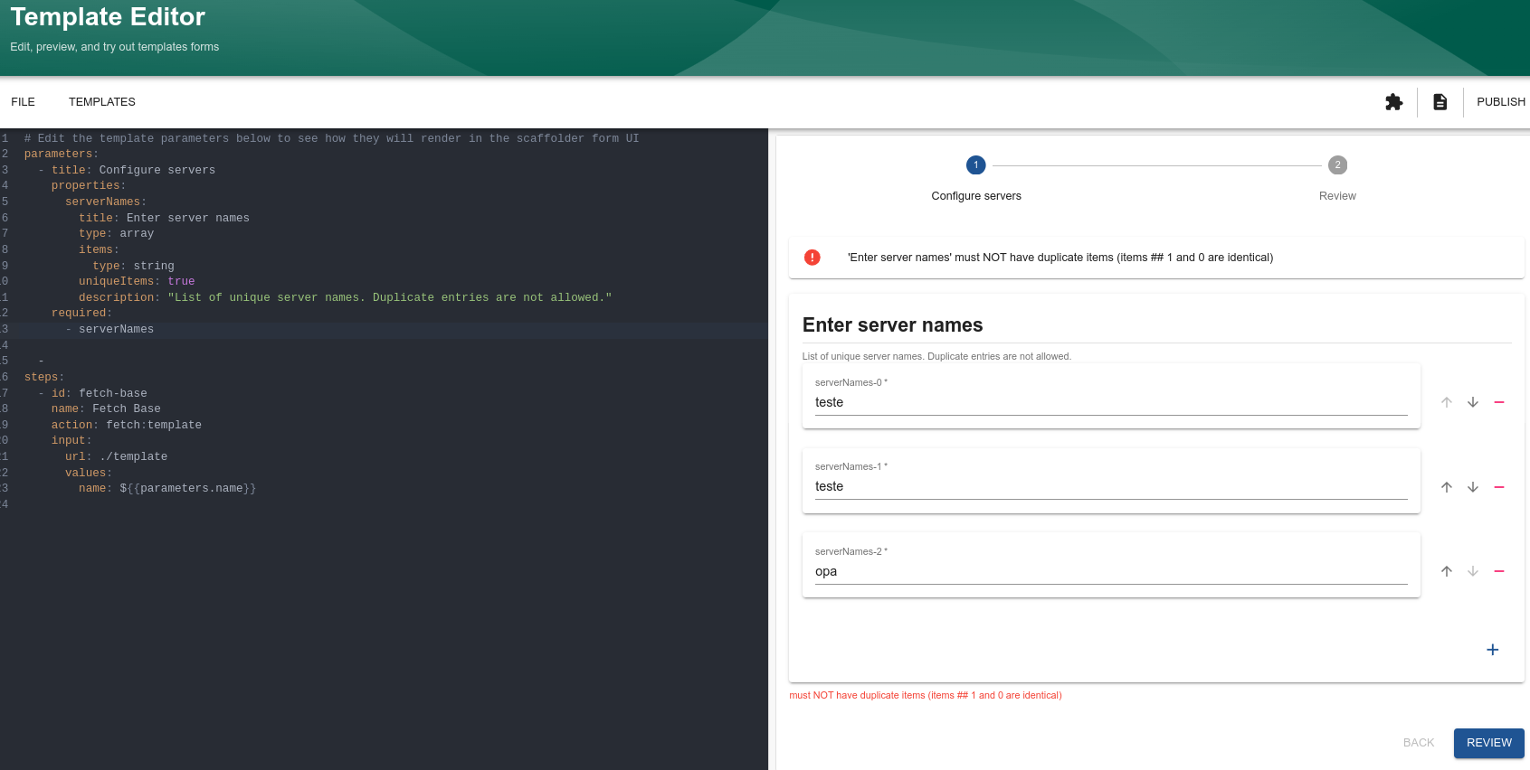
The uniqueItems in this example doesn't make much sense because each entry is unique. However, in the sense below it makes a bit more sense.
# Edit the template parameters below to see how they will render in the scaffolder form UI
parameters:
  - title: Configure servers
    properties:
      serverNames:
        title: Enter server names
        type: array
        items:
          type: string
        uniqueItems: true
        description: "List of unique server names. Duplicate entries are not allowed."
    required:
      - serverNames
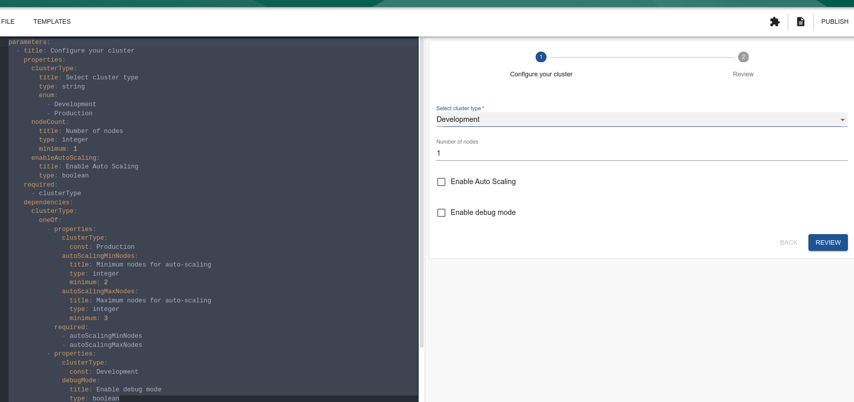
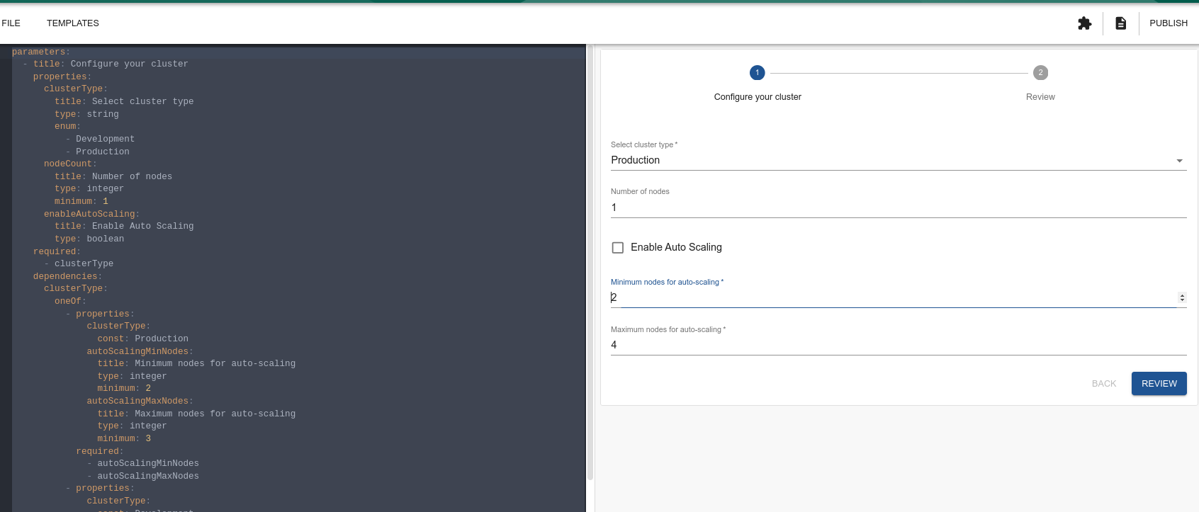
Some inputs may or may not appear depending on another entry.
parameters:
  - title: Configure your cluster
    properties:
      clusterType: # We're giving two options
        title: Select cluster type
        type: string
        enum:
          - Development
          - Production
      nodeCount:
        title: Number of nodes
        type: integer
        minimum: 1 # Here it already starts with 1 and doesn't allow zero
      enableAutoScaling:
        title: Enable Auto Scaling
        type: boolean
    required:
      - clusterType
    dependencies:
    # Depending on which clusterType we have, we need more entries.
      clusterType:
        oneOf:
          - properties:
              clusterType:
                const: Production
              # If production then these two fields will appear
              autoScalingMinNodes:
                title: Minimum nodes for auto-scaling
                type: integer
                minimum: 2
              autoScalingMaxNodes:
                title: Maximum nodes for auto-scaling
                type: integer
                minimum: 3
            required:
              - autoScalingMinNodes
              - autoScalingMaxNodes
          - properties:
              clusterType:
                const: Development
            # If development this field will appear
              debugMode:
                title: Enable debug mode
                type: boolean
We can make fields appear if a feature is enabled or not (feature flags). It's not the same idea proposed above in a standard flow, but it also works as a conditional.
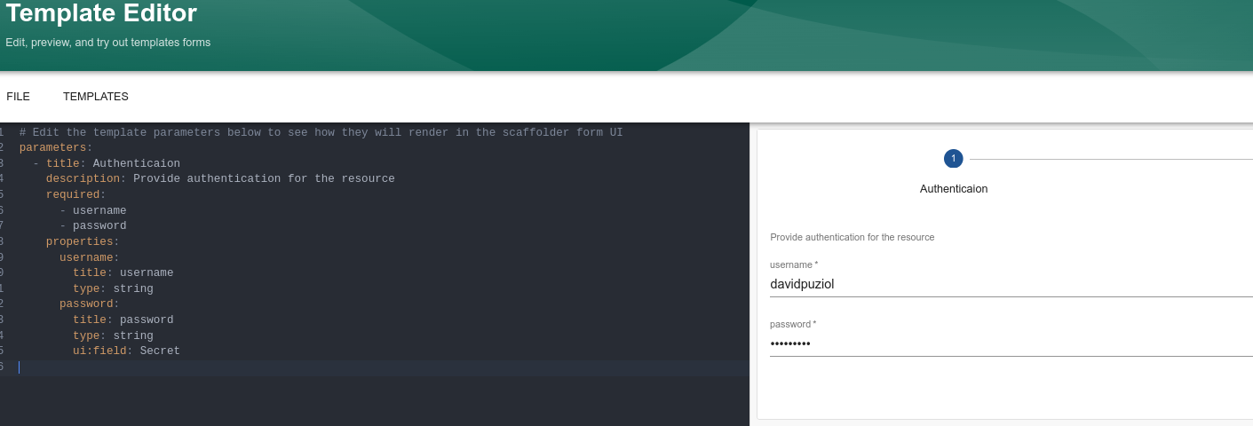
Secrets
Here we can see an example hiding the password field
parameters:
  - title: Authentication
    description: Provide authentication for the resource
    required:
      - username
      - password
    properties:
      username:
        title: username
        type: string
      password:
        title: password
        type: string
        ui:field: Secret
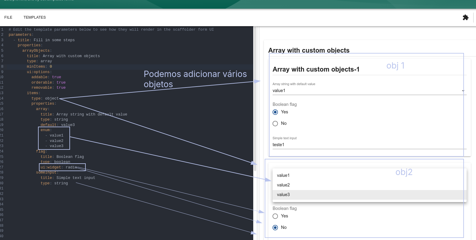
Another case is that an object can contain another, drilling down the entire properties chain.
Custom Fields
You can also create custom fields.
We configured pattern to force a regex on a specific field saying that it could only be lowercase letters and hyphens. It's perfectly possible to render a field where this is already implemented without needing to specify.
We could use this for passwords by creating a field that forces a minimum length and uses uppercase letters, lowercase letters, special characters, and numbers.
ui:field: MyCustomField
Of course, it will require better knowledge of Node, but it's not very complicated.
BuiltIn Custom Fields
In the same vein, there are already some custom fields that go beyond what the library offers and were implemented by Backstage itself.
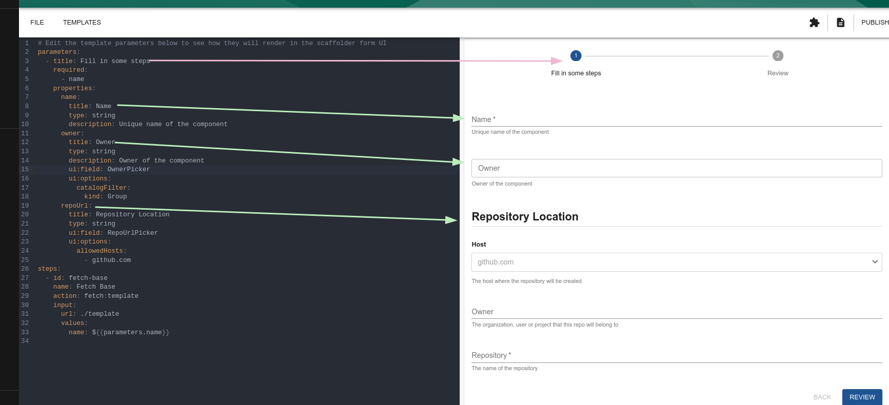
If we're delivering something to a repository, we should already map it to be discovered by Backstage. It will probably have a catalog-info.yaml that must be filled in. It will certainly be necessary to fetch entities, define owner, etc.
Here we have the set of custom ui:fields to get objects from within Backstage.
- EntityPicker
- MultiEntityPicker
- OwnerPicker (Important)
- RepoUrlPicker (Important)
- RepoBranchPicker
It's important to understand our options well because the vast majority of templates will use these at some point.
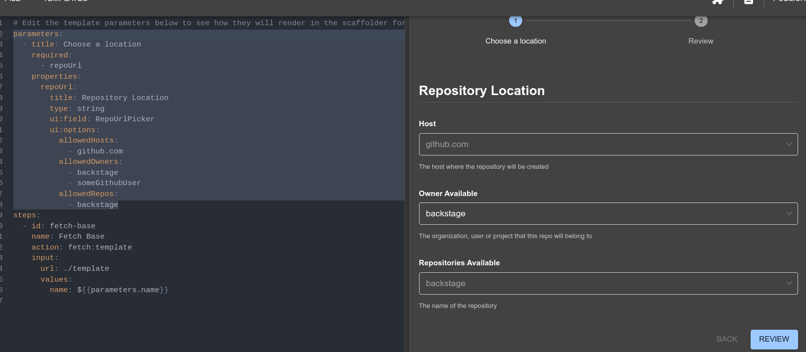
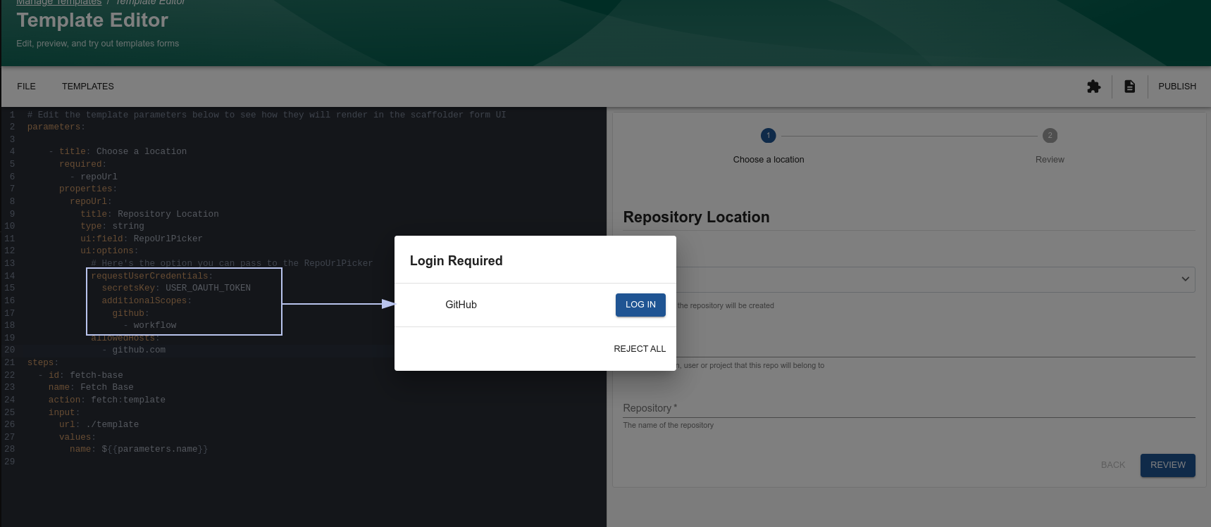
ui:field: RepoUrlPicker
Facilitates the selection of a repository provider and the input of a project or owner and repository name.
parameters:
  - title: Choose a location
    required:
      - repoUrl
    properties:
      repoUrl:
        title: Repository Location
        type: string
        ui:field: RepoUrlPicker # Backstage custom field
        ui:options:
          allowedHosts:
            - github.com
            - gitlab.com
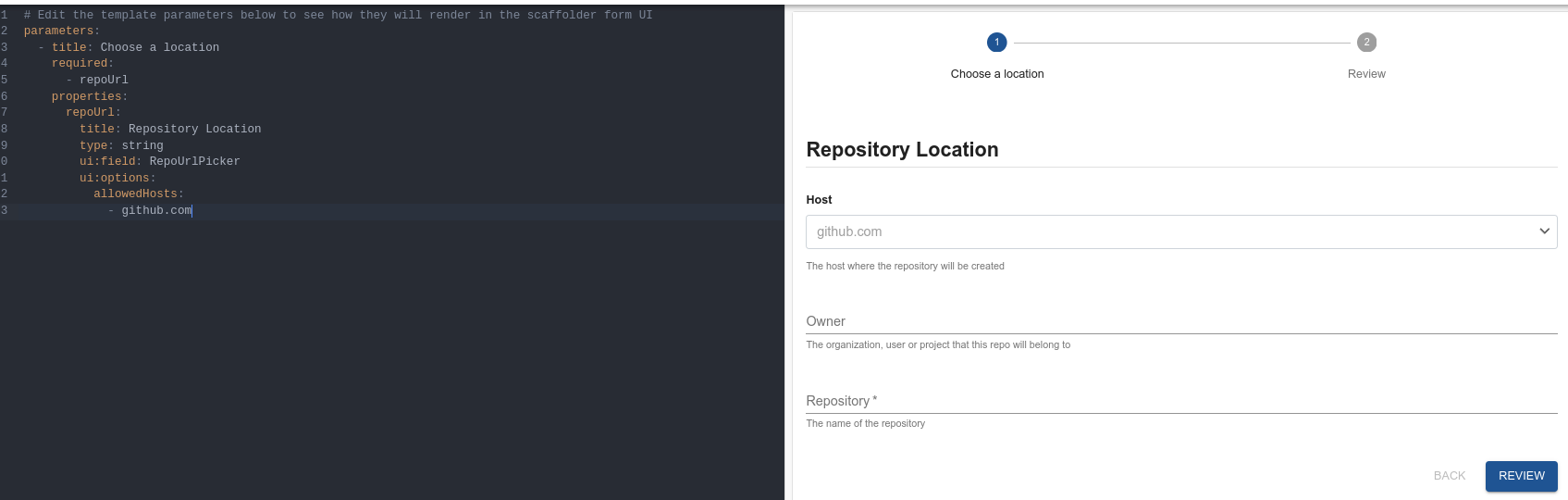
The allowedHosts must be defined for where you want to enable this template for publishing. It can be any host that is listed in your integrations configuration in app-config.yaml.
We can restrict who will be the repository owner and which repositories are allowed.
Authentication can also exist during the process, but it requires that the entire authentication part of Backstage is configured.
It's also possible to select a specific branch using RepoBranchPicker if needed.
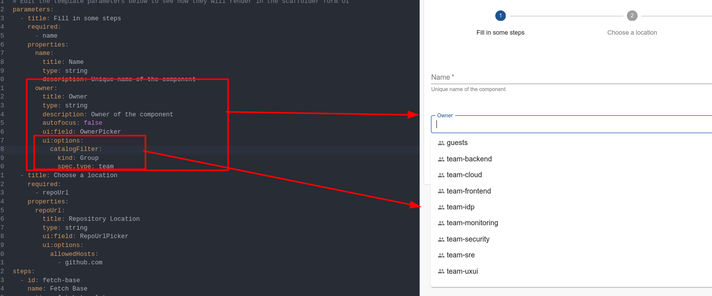
ui:field: OwnerPicker
We almost always need to define the owner of a component, and it will probably be some Group. It's not good practice to define a user as the owner of something because if they leave the system, we lose the relationships. To restrict the owner based on what we have in the catalog, we can use OwnerPicker saying that we only want groups with the specified type.
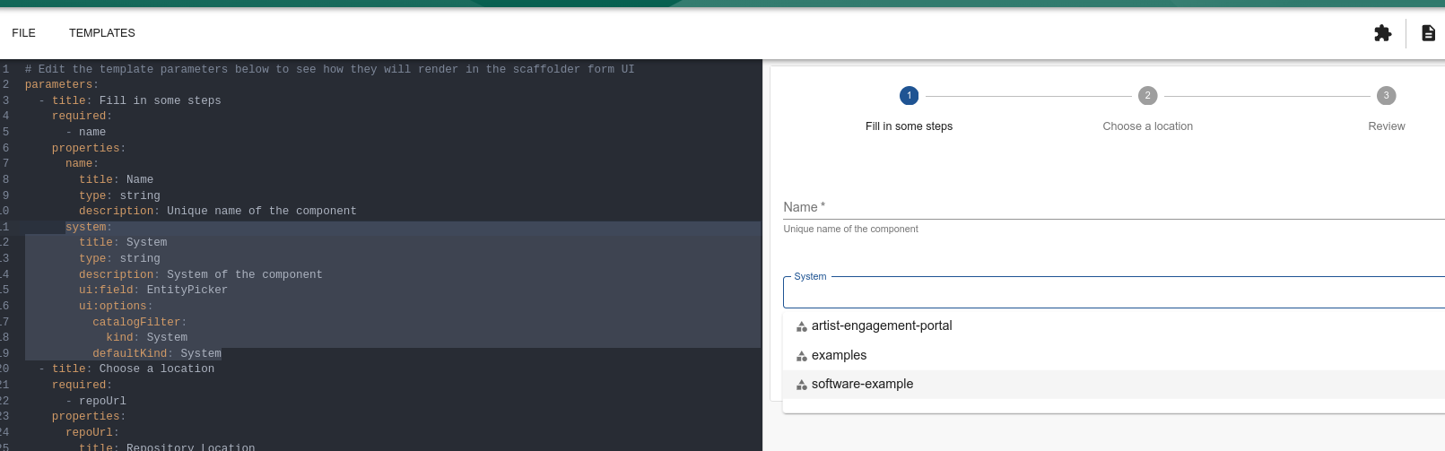
ui:field: EntityPicker and ui:field: MultiEntityPicker
Filtering an entity would be the same process. If we're going to create a component that is part of a system and we want to define which system, we could do a filter and only allow certain ones to be chosen.